TELUS Careers Homepage redesign
Overview
Tools used: Miro, Figma, FigJam
Who I worked with: Content Strategist, Data Analyst, Copywriter, Software Engineers
The problem statement: “Redesign TELUS careers in a way that articulates, differentiates, and brings to life our employer brand story and people-first culture; inspire prospective job seekers to apply for open opportunities and build positive brand affinity for TELUS as an employer”
Step 01: Data & Research
Overall data about the careers homepage
Telus Career homepage is a high-traffic page with most entries coming from the organic search
Highest clicked Call to Action is’ Search all jobs’ with 75%
Why TELUS page: 50% bounce rate, little engagement with the video, 35% of the clicks are to search all jobs
Why redesign?
Outdated design with non-engaging content
The page overall is not exciting and doesn’t provide enough information to the users about Telus values or life at Telus.
Having the ‘Why TELUS’ page separate from the homepage introduced an extra click for the customers who want to learn more.
Competitive Analysis
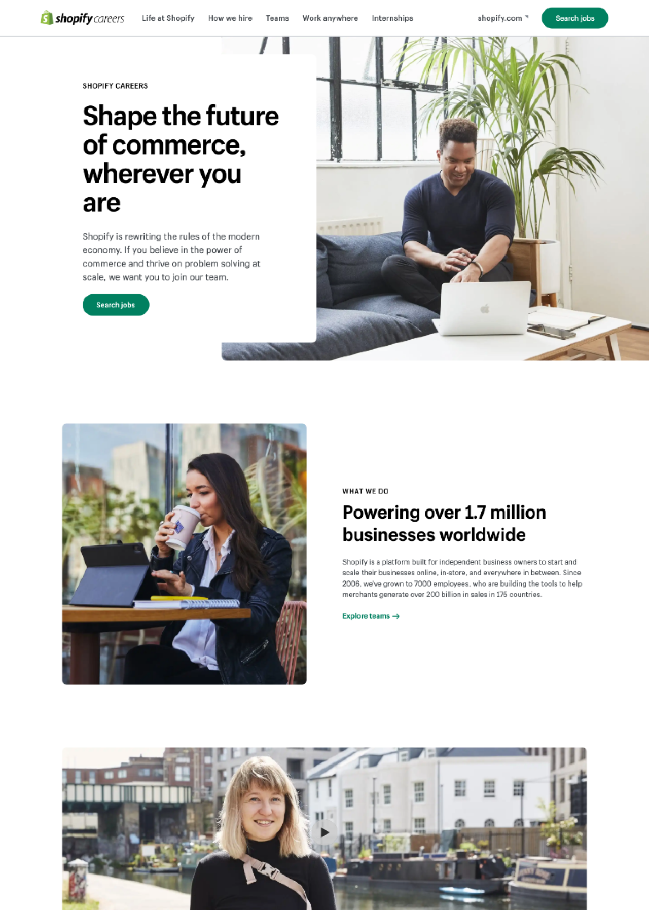
By using Miro we have looked at a couple of industry-leading companies such as Apple, Google, and Shopify. Here is what we found common between these companies:
Each homepage has a similar type of content around Life at the company, company brand, and teams.
Bold imagery and concise copy (tag line ) approach in order to convey more information to the customers.
Most of the companies we looked at have search first approach where customers can engage directly.
Clear categorization of the teams and functions people can apply to.
Depending on the company a separate section for student and graduate programs .
Easy to scan through and learn information about the company
Step 02: SWOT Analysis
By utilizing Miro, I facilitated a workshop where my team had to chance to identify the pain points and the opportunity gaps around the homepage and the careers journey.
Defining the problem
Identified pain points
Teams and categories are not identified clearly
IA was confusing on the homepage and on the navigation
Page content and visual were not exciting and engaging
Why TELUS had good content that was living separately
HP is not explaining a lot about TELUS and the values
Telus digital was not a part of it
Identified opportunity points
Cleanup the navigation and the homepage
Merge Why Telus content over to homepage content in order to elevate extra click
Overall refresh to visual imagery in order to reflect the new design system
Include diversity and inclusion page
Working with content strategist come up with a better way to explain teams and categories rather than just having links to the R&L pages
Step 03: Designing the content outline
At this stage by utilizing our SWOT analysis, gathered data, and competitive analysis we worked on designing the content outline before the low-fidelity stage on Figma.
Here are some principles we have discussed to have it on our wireframe:
Utilizing employer brand messaging in order to remain consistent with Masterbrand
Merging the ‘Why Telus’ page and carrying over the important content such as ‘Life at Telus’, Telus values and benefits
Adding a specific Benefits section and creating a benefits page to give more information to the customers
Clearly identify the teams and have a space to give more explanation around what that team means to Telus
Giving room to the testimonials and awards
Snapshot of the content & design jam on Miro
Step 04: Designing and Wireframing
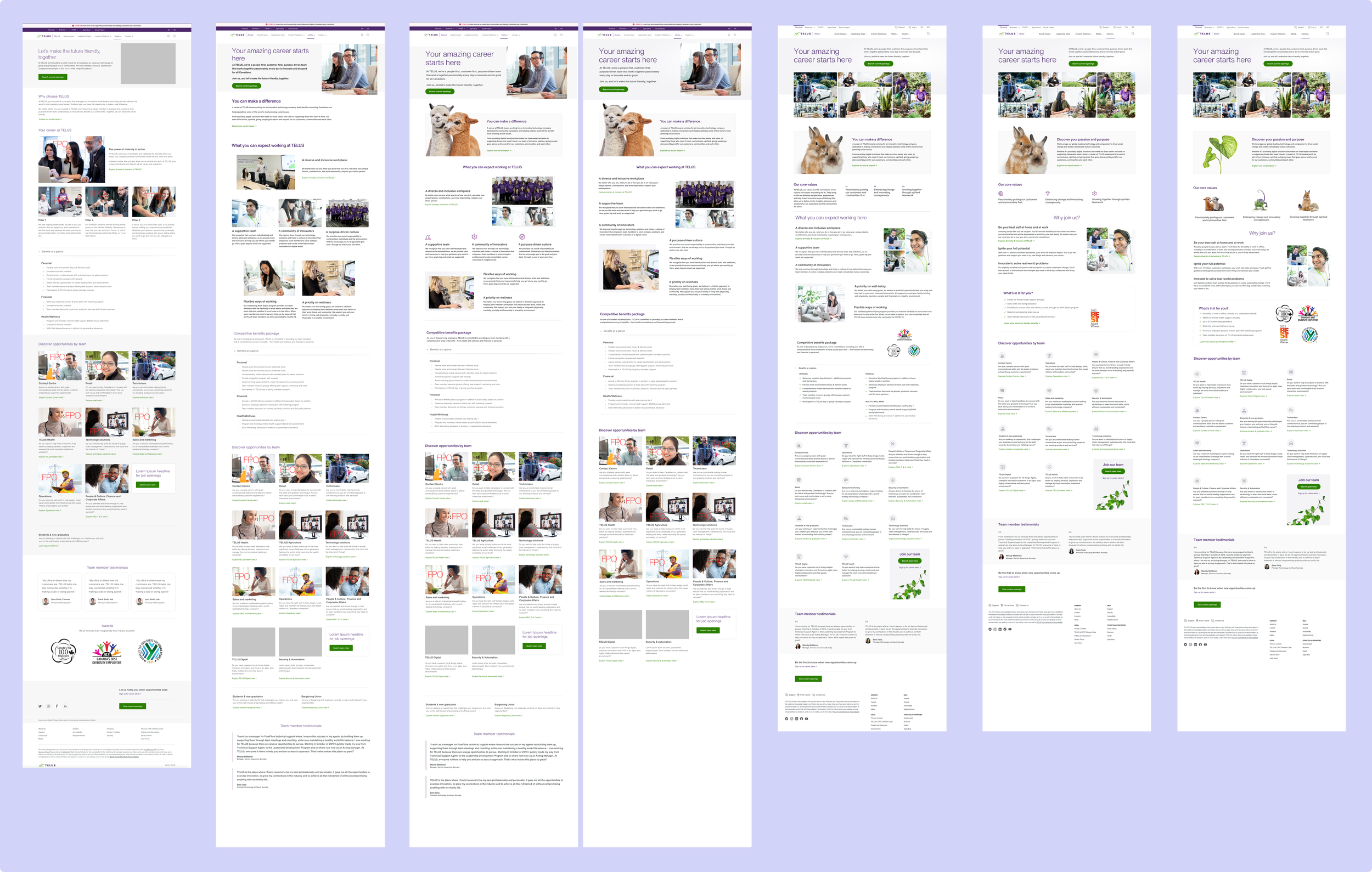
Evolution of the design
After many rounds of feedback from the stakeholders here are some of the key changes we made to the design:
After many iterations, we agreed on having a more concise way of displaying the ‘Life at Telus’ component.
Having brand messaging up and being the face of the careers page
Everyone agreed on merging the Why Telus page and reconstructing the in-page navigation
Instead of having one main CTA, we decided to have multiple along the page scroll
The protoype
What has changed with the new design?
The bounce rate decreased by 25%
Search all jobs consist 64% of all clicks, 94% being the hero call to action
The time spent on the page increased by 7%
Visit the live page here!


